
MyFitnessPal
Feature Addition Case Study - 2025
My Role
UX/UI designer, researcher, branding, wireframing, prototyping, user testing
Timeline
4-6 Weeks
Tools
Figma and Figjam
The Challenge
There are plenty of apps on the market that do a great job logging food entries and tracking your most frequented foods. However, even with this feature available, there are those who struggle to consistently meet their caloric goals. For many, tracking calories isn’t the most difficult part, but rather what foods to eat that align with their specific goals.
Our Solution
We decided to add a feature to a popular fitness and health app, MyFitnessPal, that would provide food suggestions based on a user’s remaining daily calories. In addition, the user is also able to prioritize what foods are shown based on their macronutrient goals.
By creating this feature, we hope to help users who have difficulties deciding what foods to eat, be more consistent in meeting their health goals.
The Design Process
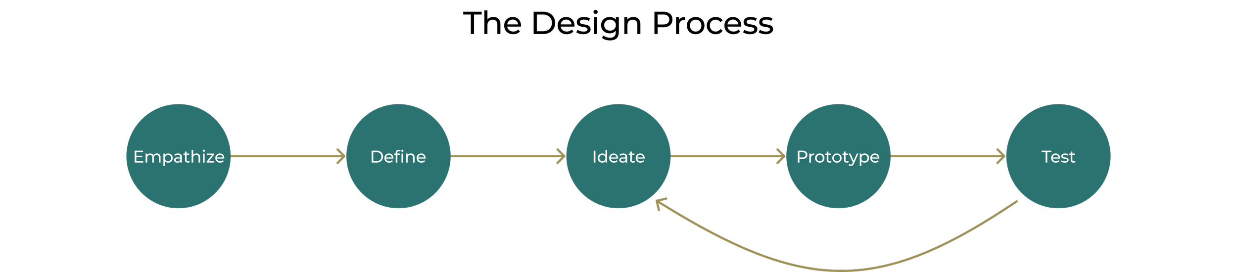
Empathize
Research
A combination approach of sending out a survey and user interviews were done for the research portion of this project. With regards to not meeting caloric goals, users have stated that breaking routine, time constraints and not knowing what to eat were the primary drivers. When asked about receiving assistance from the app, 40% stated that having food suggestions would be helpful and 30% said that reminders and push notifications would be beneficial.
For the interview portion, I was able to get in touch with 4 participants, ages between upper 20’s and lower 30’s. They are avid gym goers that count calories and use MyFitnessPal on a regular basis. For them a pain point for not reaching their goal is not knowing what to eat. After a full work day followed by the gym, these users found it difficult to figure out what foods to eat while also keeping their macronutrient intakes in mind.


Affinity Mapping
Following user research, I took the data points and put them into an Affinity Mapping Diagram. By organizing the different pain points felt by the users. I was able to start identifying features that would address their needs.

Secondary Research: Competitive Analysis
Competitive analysis was performed on other market leaders to see if there was a product that addressed user problem points found during research.


While doing market research, I concluded that the features involving any kind of suggestion were locked behind the premium features. Even then, the closest feature were Meal Plans that provided users with a full day’s worth of foods. There were no instances where users could get individual food suggestions based on what calories were remaining. This was a clear gap in the market that I wanted to take advantage of.
Define
Point of View Statement
I would like to explore ways to help working professionals consistently hit their caloric goals because they usually forget to eat due to accumulated stress throughout the day
I want to help health conscious individuals reach their caloric goals because it’s sometimes difficult to to choose macronutrient dense foods when there are so many options
How Might We?
How might we guide new users to effortlessly make food choices that support their nutritional goals with clarity and confidence?
How might we transform choice paralysis into a fun and seamless experience, guiding users to the best options for their daily goals?
Feature Set
After narrowing down the problem using the Point of View statement and How Might We question, I developed a set of features based on insights from the interviews. Food suggestions became the core feature, and to give users more flexibility, I included customizable parameters for each recommendation

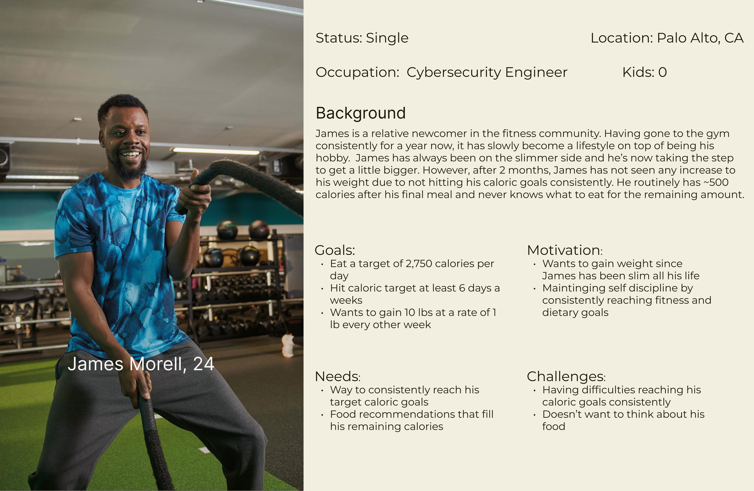
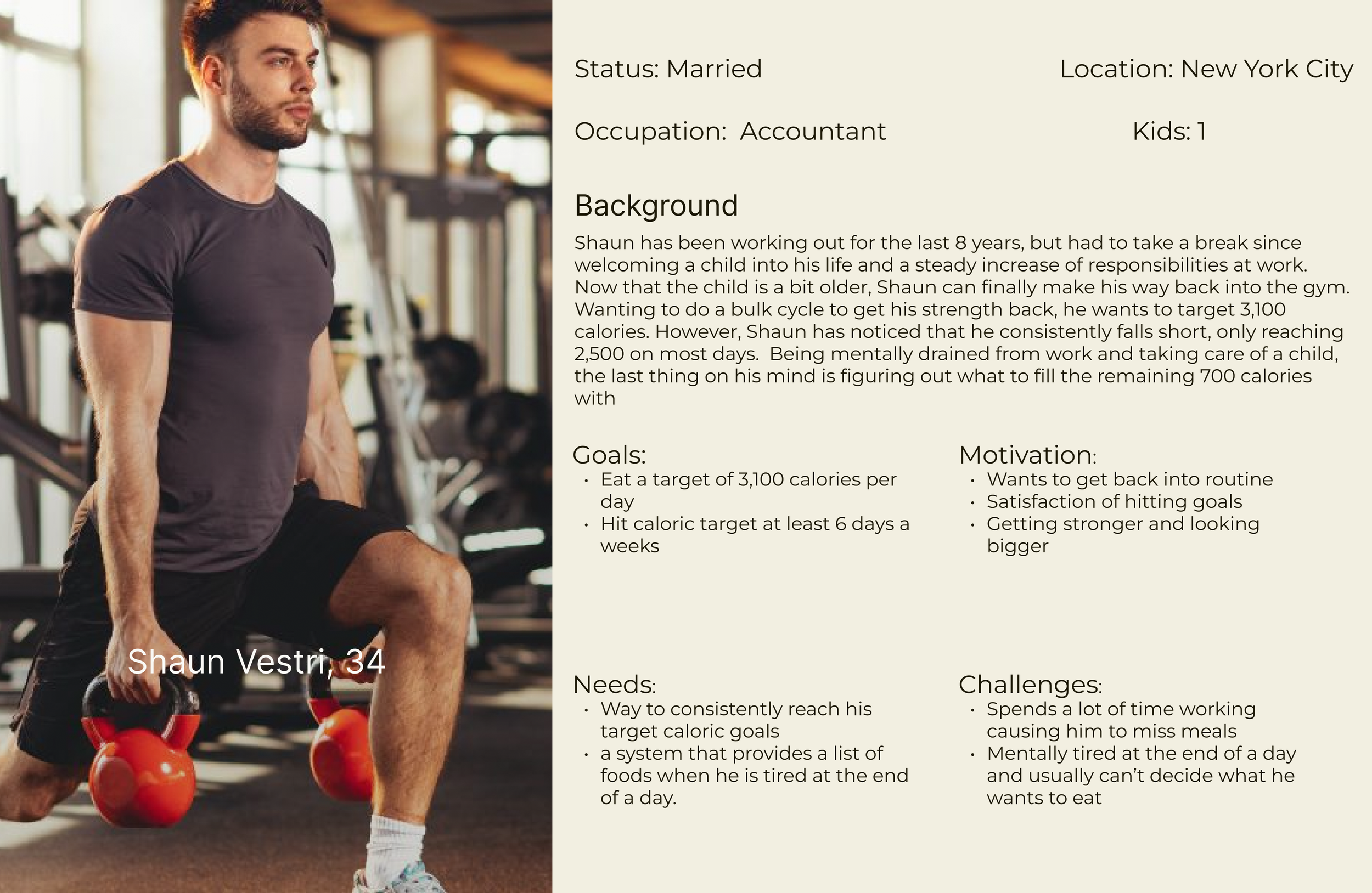
User Personas
The persona’s I created were combinations of the people that I interviewed. Given the narrow focus of my intended feature, the needs of my persona’s were very similar because it all revolves around not reaching caloric goals consistently.
Ideate
User Flow
Creating a user flow allowed me to step in the mindset of my personas and figure out which steps in the process should be prioritized.

Task Flow
The task flow guided me toward the key screens I would need on this project. In addition to the main feature, I also learned what filters I would need to create in order for this to work.

Low-Fidelity Wireframes
Taking into account what I learned from user research and flow development, I made my initial sketches of the product. By using and taking inspiration from other pages of MyFitnessPal, the overall design was quicker than expected. Keeping the needs of the users I interviewed in mind, I aimed to create a simple feature with a focus on customization and easy to track changes.


Prototype
Hi-Fidelity
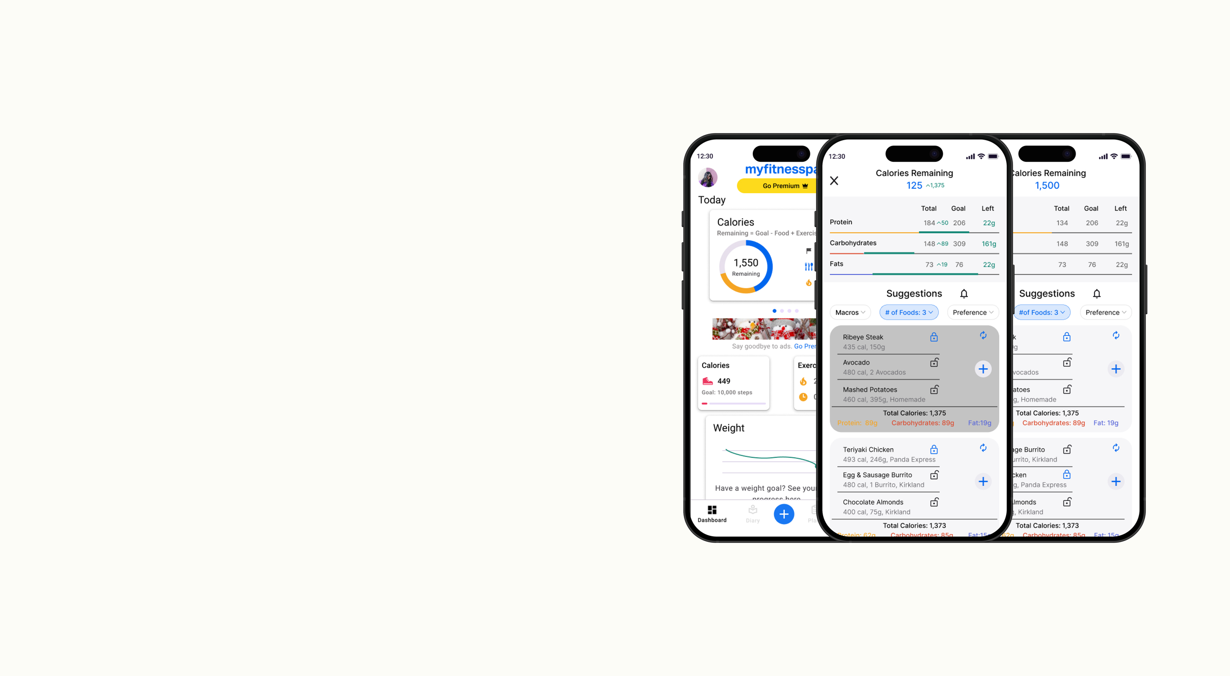
The transition from low/mid wireframes to high-fidelity started with a lot of screenshots and color matching. Consistency was critical since the feature was being added to an existing brand. Each page needed to follow the same visual design as the rest of MyFitnessPal

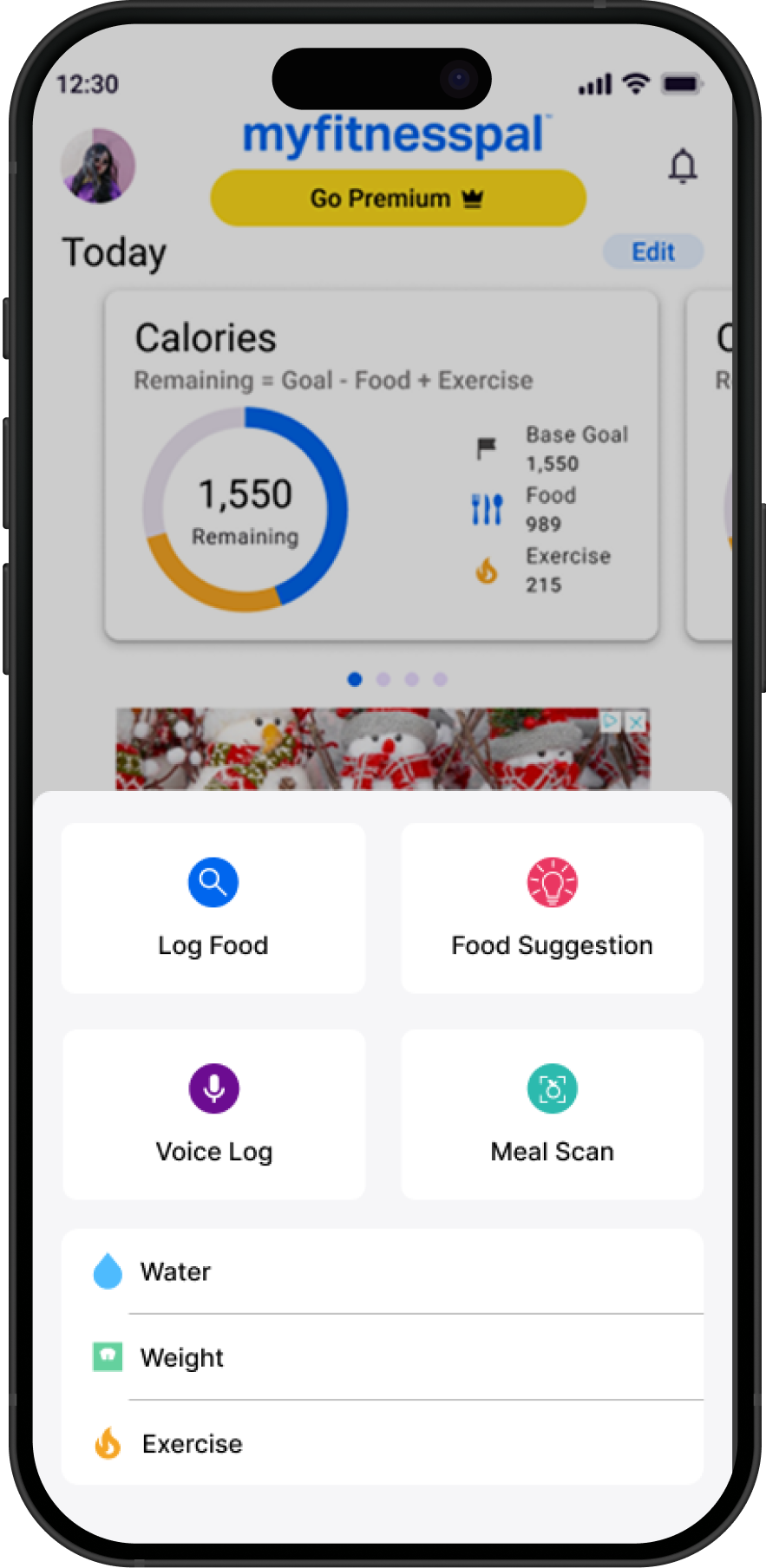
This is the 1st screen of the new feature. Individual foods are grouped showing the total calories of each set. While keeping important metrics, I tried to make this page as straight forward as possible


In my opinion, this is the most critical screen. By tapping on the food card users can see how it affects their calories and macronutrient goal. This lets users compare different cards and pick the choice that works best for their individual goals.


The feature included 3 different filter options: macros, # foods, and preferences. The goal of this feature was for users to reach their caloric goals, but I felt it was important (and ethical) to give users a choice as to what suggestions would appear.


Testing
Usability Testing
For the usability testing, I asked 5 participants to perform the following tasks:
Navigate to the food suggestion page,
Have the feature provide food suggestions that are more protein focused and with foods you’ve eaten before, and
See how each of the food choices affect your calories and macros and add the food suggestion you like to your log
What went well?
Overall, all users found the feature to be be intuitive from beginning to end, as evidenced by the 100% success rate of all 3 tasks. Visually, the feature felt native to MyFitnessPal and additional text and elements were all clear and easily recognized. As I expected, users enjoyed the visual representation of the macronutrient slider and value increases when a food grouping was selected.
What can be improved?
While users liked the macro slider, 2/5 testers felt that the delta slider should have more “pop” compared to the grey bar underneath.
Some filter labels were also unclear as 2/5 users asked me what the different “preference” filters represented.
First iteration only had the total calories shown in the food card; 2 users pointed out that they wanted to see the macronutrient totals as well.
Iterations
Quality of Life Additions
Updates that provide users with more customizations to the suggestions they receive
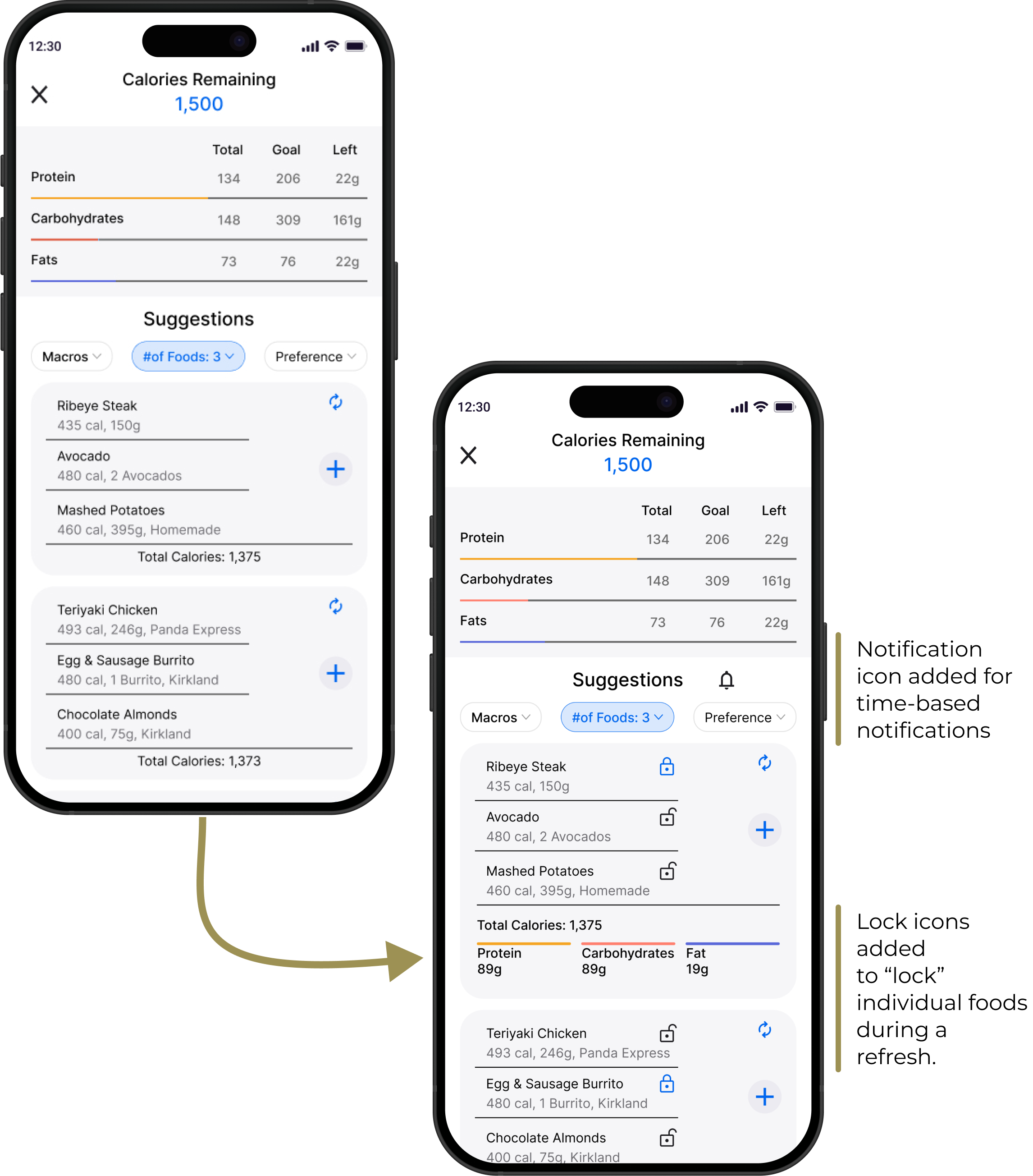
Time/Calorie Based Notification
Initial research showed that users wanted a notification system to remind them that they may miss their daily goals. To make it non intrusive, I designed an opt-in only system.

Visibility Changes
Small but impactful changes were made some elements to help those who might be colorblind

Filter Page
Filter labels updated for clarity per user testing feedback

Final Thoughts and Reflection
I was surprised by how many users struggled to reach their goals. Initially, I worried the project's focus on food habits would limit data, but the honest feedback I received was encouraging. Facing failure is tough, and I’m grateful to those who shared their experiences. As someone who works full-time, hits the gym, and occasionally misses caloric goals, it felt rewarding to design a feature that helps others succeed.
Research showed that users often missed goals due to confusion over what to eat or frustration with complicated food logs. To reduce this, I prioritized simplicity and intuition—minimizing text, clearly displaying nutrient deltas, and ensuring users could add a food group in just four steps. The feature is also customizable for more flexibility.
Overall, I believe I was able to create a feature within MyFitnessPal that effortlessly helps users make informed food choices that support their specific nutritional goals.