
Smash Fitness
Responsive Design Case Study- 2025
My Role
UX/UI Designer, researcher, branding, wireframing, prototyping, user testing
Timeline
4-5 Weeks
Tools
Figma and Figjam
The Problem
Smash Fitness is a local gym in Sunnyvale, CA that offers specialized fitness classes, including martial arts and unique exercise alternatives. The web pages related to this business were outdated, and the user experience lacked a cohesive design. Some of the UI elements had no function, there were issues with contrasting colors, and bad design flows led to user errors. After coming across this business, I decided to do a redesign of some of the critical pages and task flows.
The Solution
The goal of this project was to enhance the site’s responsiveness while establishing a clear and intuitive content hierarchy. Aesthetically, I aimed to create a modern, approachable look that remained cohesive across all pages. This design update was intended to boost conversion rates by turning site visitors into class attendees, while also reinforcing trust and loyalty among existing users.
Research
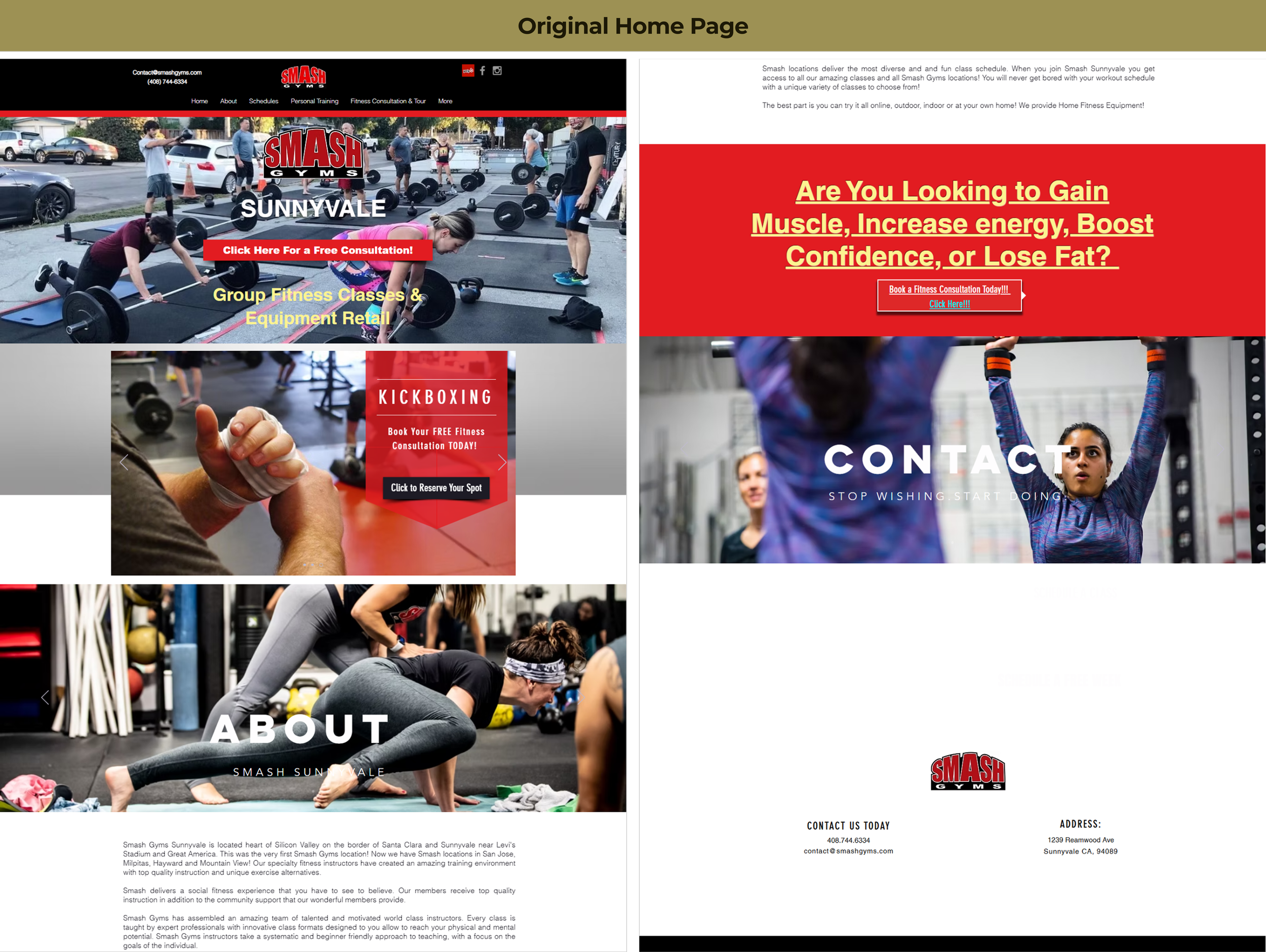
Site Audit
At first glance, the homepage design appeared outdated due to its use of color and font selection. CTA’s were not entirely clear, and the site had inconsistent themes. When diving deeper, the rest of the webpages suffered from a lack of a clear hierarchical structure, which is important to UX/UI design.
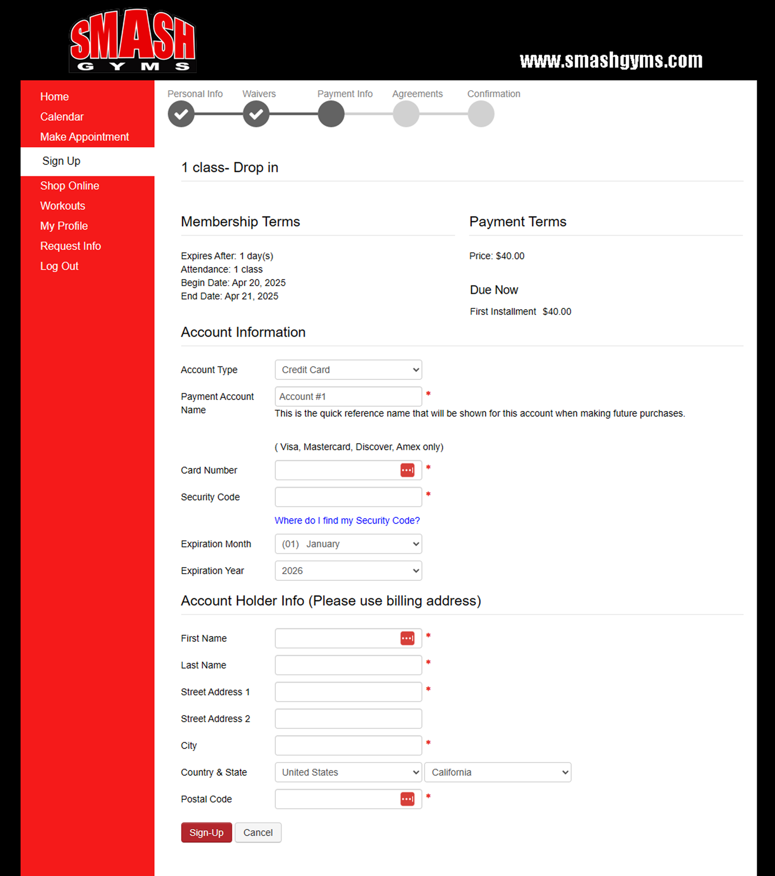
During the website audit, I went through the process of searching, reserving, creating an account, and paying for a class. While generally straightforward, parts of the process were confusing and reflected poor business practices.
Starting with the confusing aspect first, their scheduling calendar resembles a simple spreadsheet, which I appreciated. However, there are clear visual design issues below. in addition, when moving forward with class selection, there is a lack of information about the class and what kinds of memberships are involved.


The information provided is extremely limited. There are no descriptions about the class or intensity level and no explainations about what the different memberships include.

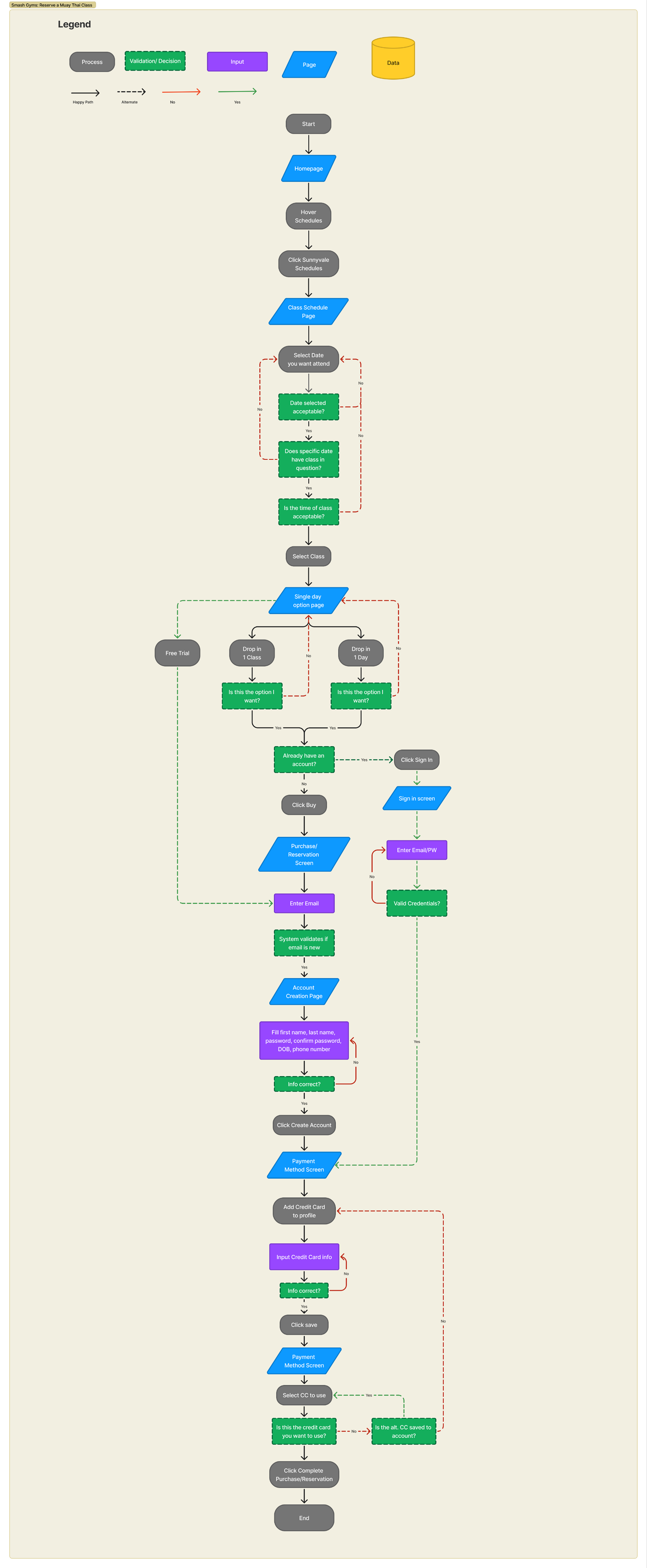
User Flow
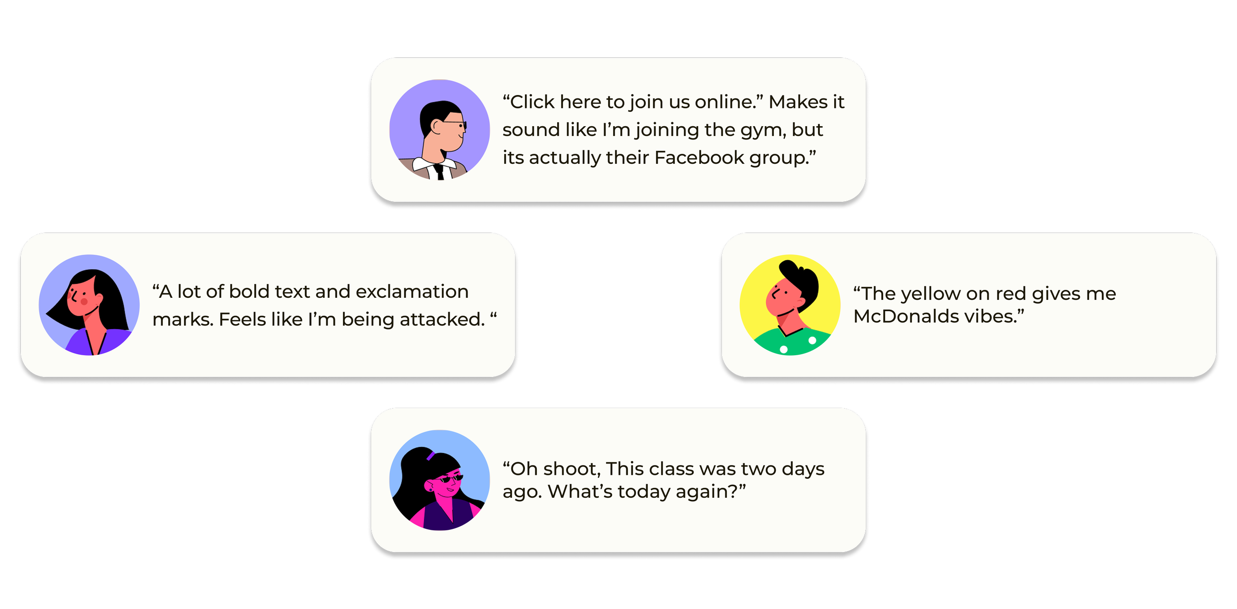
“Click to join us online” is a link to join Smash Fitness’s Facebook group. Not the gym itself.
These two pages are dated one week apart, yet there are minimal visual difference in the status change between these two pages.

One example of poor business practice occurred after I entered my credit card informationthe CTA was labeled “Sign-Up,” which led me to believe it would take me to the next step. Instead, clicking it immediately charged my card and confirmed the reservation. I later discovered that the site stores your credit card information without clear notice, and the only way to delete it is by calling customer service. These practices feel deceptive and could deter new customers.
**As of June 2025, Smash fitness has implemented an option to remove the saved credit card online.**
Interviews
User interviews were key to understanding what drives gym website visitors to become paying class attendees. I interviewed five people—three who take fitness classes and two who go to the gym but don’t attend classes. Users emphasized the importance of clear class descriptions (100% of users) and intensity levels (80%). Major turn-offs included unclear pricing and being forced to create an account to see costs (100% of users). During a task-based audit of the Smash Gyms site, all users struggled with navigation and concluded they wouldn’t attend a class based on their experience.
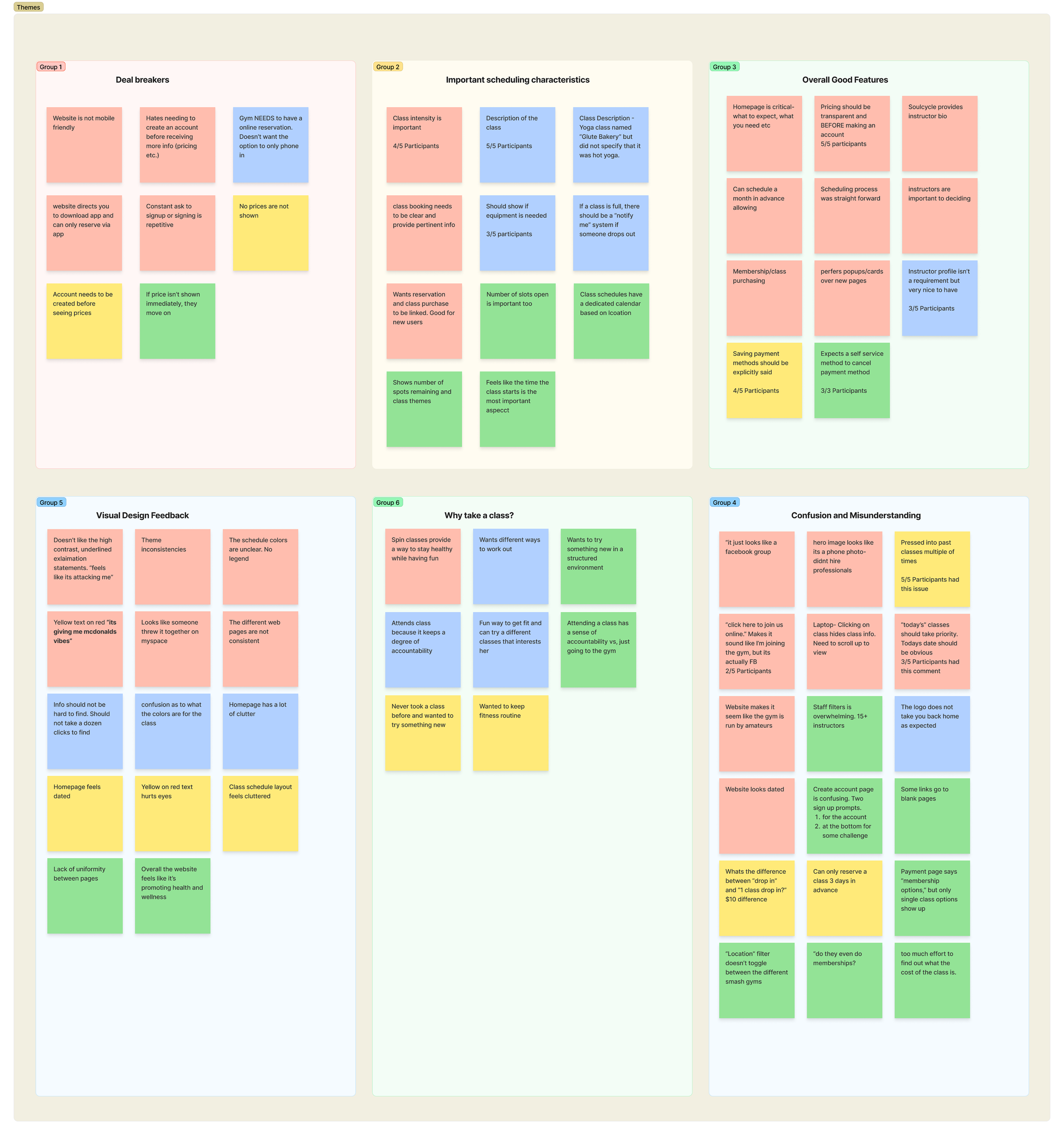
Affinity Map
After gathering data from the particiant interviews, I grouped similar points together and created inferred a collective theme for each group.
Competitive Analysis
My final research method was a light competitive analysis focused on gathering inspiration rather than disrupting the market or capturing competitor share. The goal was to improve the existing site, not reinvent it. For reference and ideas, I looked at Equinox, CycleBar, 49er Fit, 24 Hour Fitness, and EOS Fitness..
Equinox
For the overall aesthetic, I drew inspiration from a toned-down version of Equinox to give the site a modern feel. Instead of luxurious, empty visuals, I featured training photos to highlight the gym’s dynamic environment."
Point of View
I want to redesign Smash Gym’s website to inspire trust and motivate action by making its offerings clear and relatable. This includes improving the class scheduling experience so that users can easily understand what each class entails and confidently sign up, knowing it is the right fit for their goals.
How Might We
How might we redesign Smash Gym’s website to build trust and help users confidently choose and commit to classes that align with their fitness goals?
I also decided to include a second HMW statement from a more business-oriented perspective. While we design for users, I believe it is important that we also keep a business’s interest in mind.
How can we redesign the scheduling site to provide critical information to new visitors, thereby increasing our conversion rate and encouraging them to visit the gym?

Cyclebar
Inspiration for a scheudler came from Cyclebar. When looking at this page, only the critical information is provided, making it simple to use and easy to look at
Point of View and How Might We
Following the interviews and competitive analysis, I began to define my problem. By taking the learned insights, I developed a point of view statement and how-might-we statements.
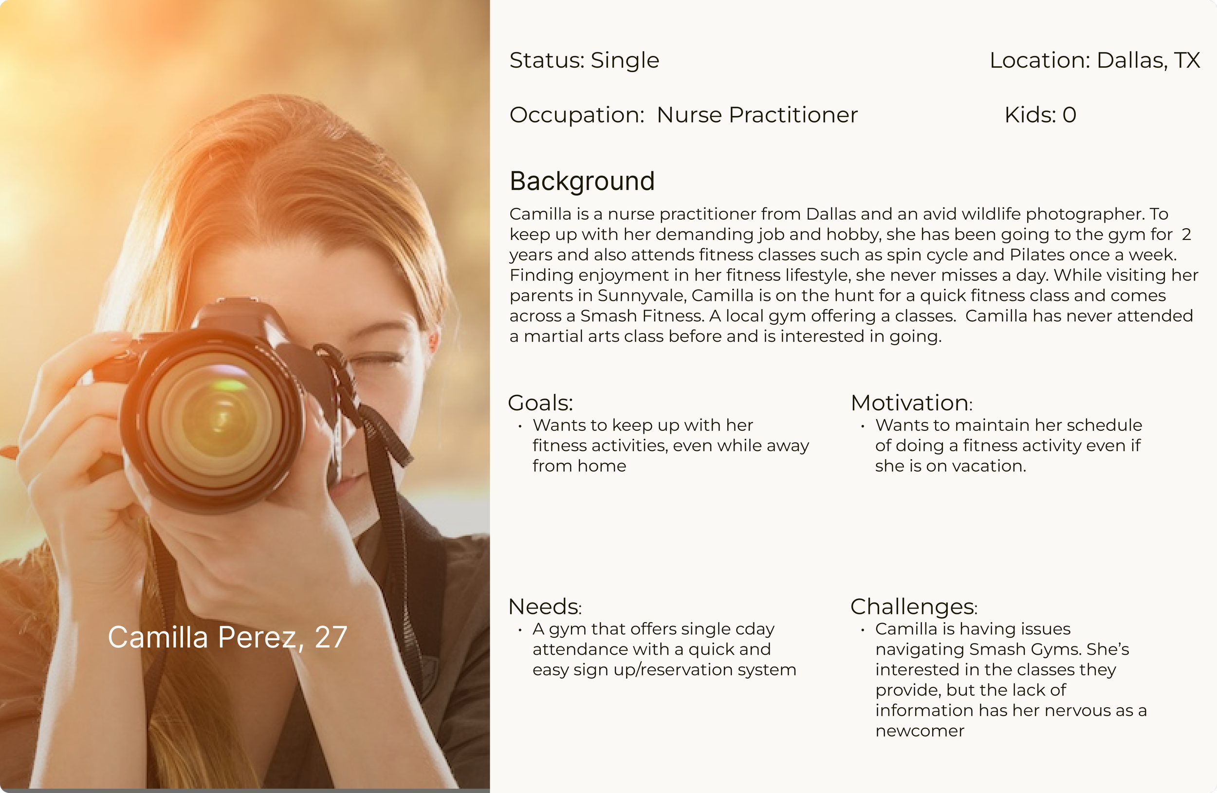
Personas
While the gym advertises to be welcoming of all skill levels, I decide to design my persona’s as individuals who have experience going to the gym. In my interview findings, I found that beginners had preferred to attend larger more commercial gyms compared to more local offerings.
Paper Sketches
High Fidelity Prototype

Research Conclusions
Based on the information gathered from the interviews and design directions from more popular fitness sites, I concluded that the most effective way to help Smash Fitness was to redesign their homepage and their class registration flow. By making these changes, I expect to see an increase in conversion rates from site visitors to actual attendees.

Digitizing Sketchs Into Low Fidelity Wireframes


Usability Test
Usability tests were performed with 5 individuals. Their main task was to reserve and pay for a class. While they performed that task, I also asked them to keep in mind the overall aesthetics of the different pages and to note any areas that were difficult to navigate and what failed to meet their expectations. At the conclusion of the usability test phase, I created an affinity board to group the collected data.

What Went Well?
All participants completed the task successfully and found the process simple and intuitive. They specifically appreciated the class description overlays. The new homepage was seen as a major improvement, clearly communicating the gym’s core values. Importantly, when compared to the original site, users felt the updated version maintained brand consistency—it felt like a refresh, not a rebrand.
What Needs Work
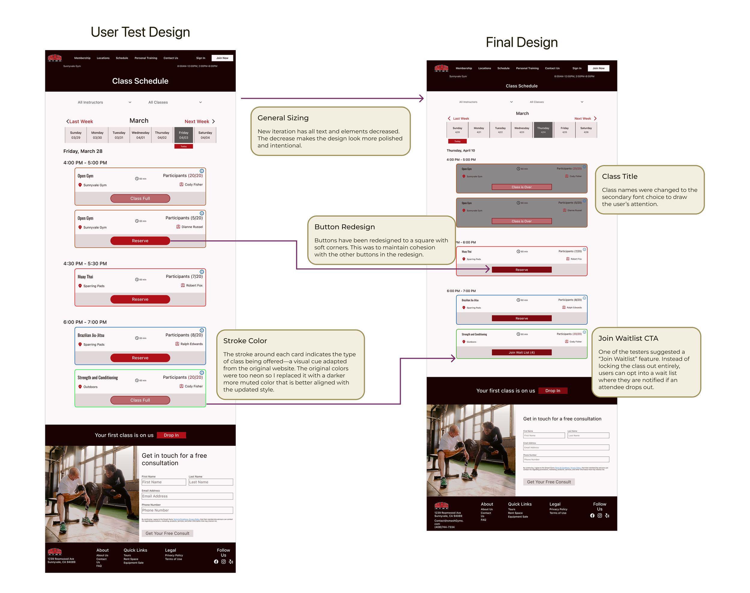
Although users noted that the text and elements were visible, they said that the overall size of everything was too large. 40% of users also wanted more obvious feedback that their class had been successfully reserved. Other issues revolved around features that the testers wanted to see, such as: a wait list, instructor profiles, and additional payment methods.
Iterations
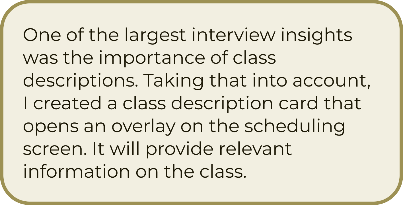
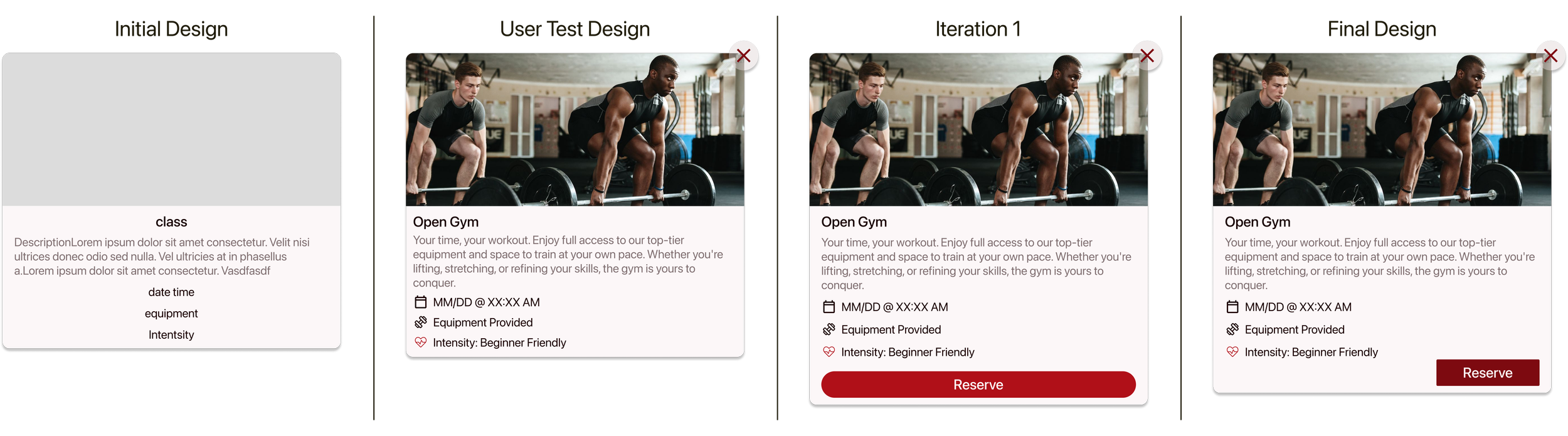
Class Descriptions
These were a key feature in my design, as all interview participants emphasized their importance. During usability testing, users suggested that the overlay should also include a CTA to streamline the task flow and reduce the number of clicks needed to book a class.
In a design review with my mentor discussing “Iteration 1”, we evaluated the visual balance of the feature. Due to the heavy use of left-aligned text, we agreed that placing the CTA on the right would improve visual harmony. Additionally, I updated the button’s color and shape to match the site’s existing UI elements, ensuring consistency and cohesion across the experience.
Class Schedule
One of the biggest pieces of feedback received was not specifically about the scheduling, but it was the best screen to showcase it. Users mentioned that the size of all text and elements were too large. While visibility and clarity were not an issue, the large sizes made the design look strange.
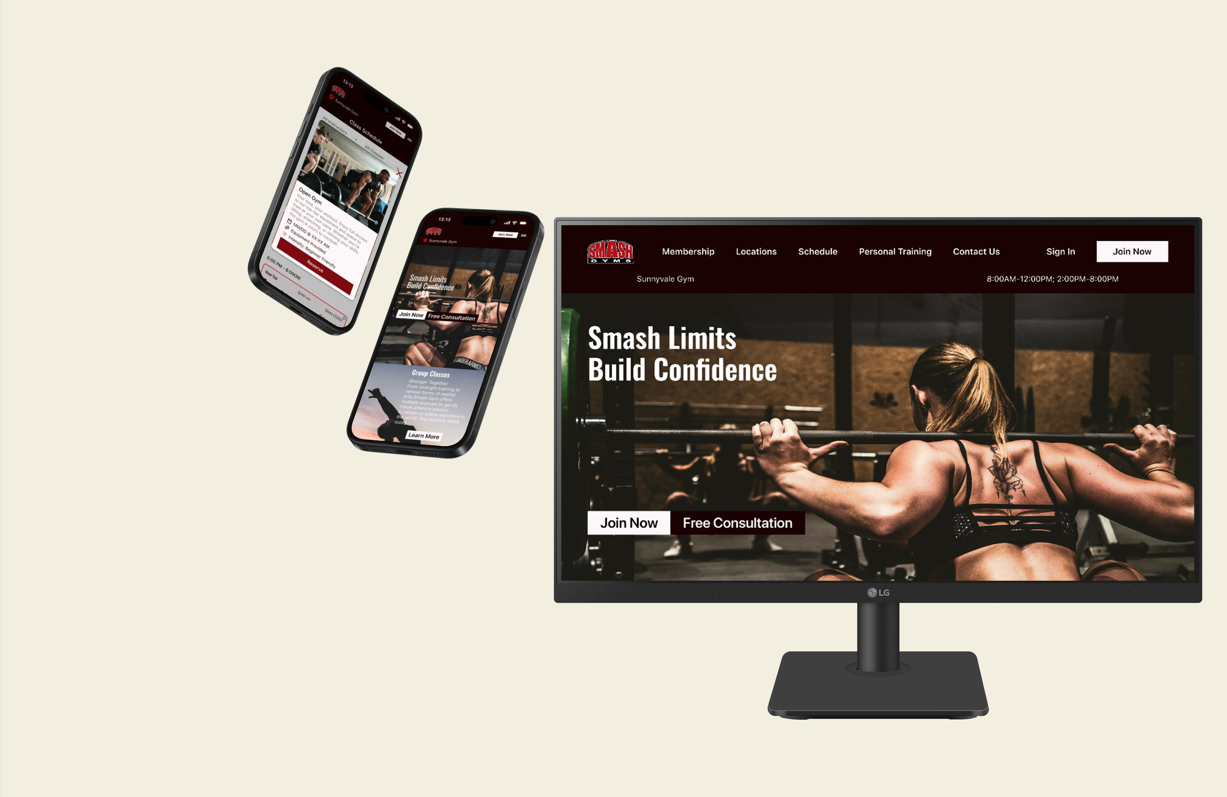
Final Design: Desktop
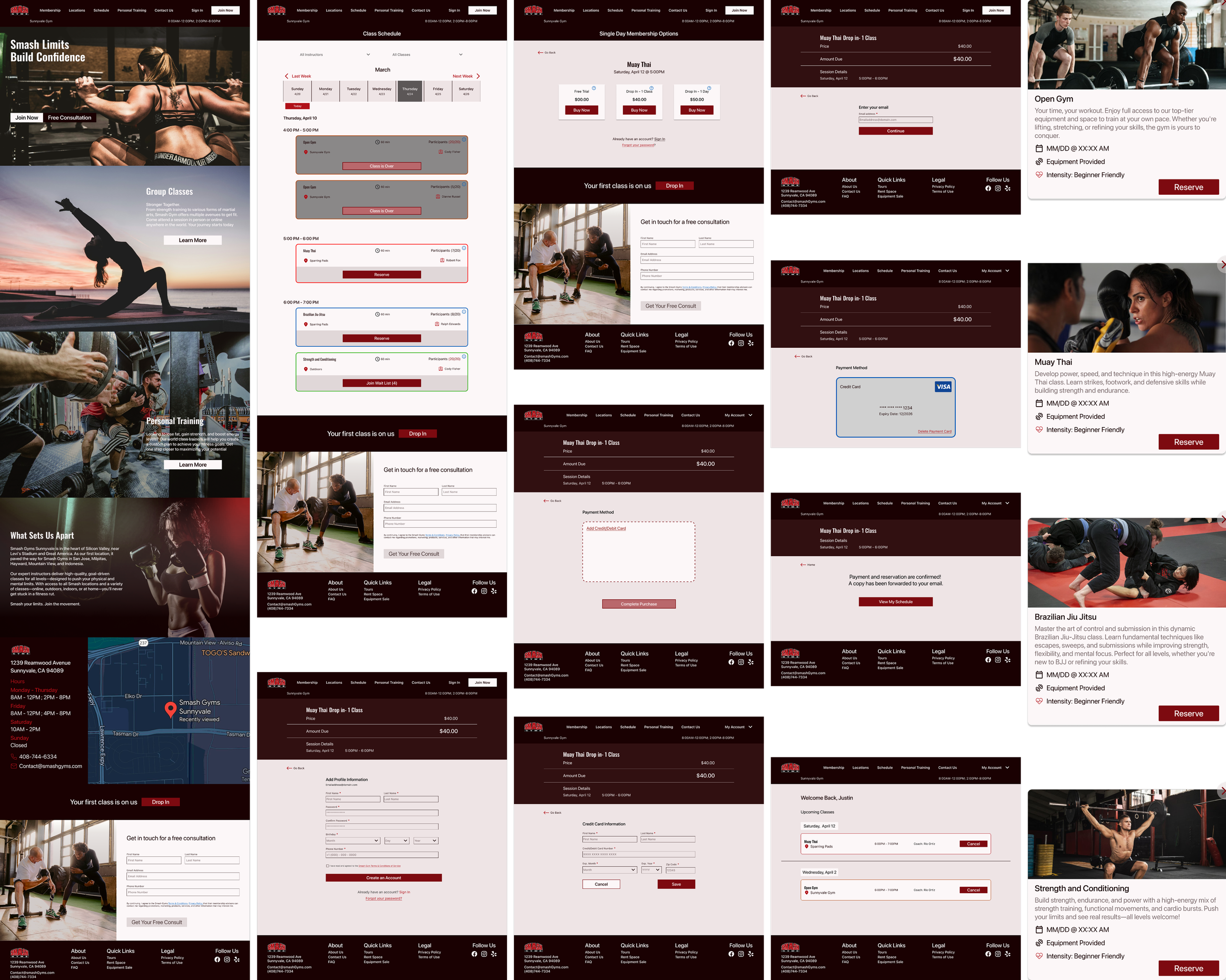
Final Design: Responsive Mobile Format
In addition to redesigning the Smash Fitness website for desktop, I also created responsive designs for several key screens. For this project, the most important screens were the homepage, class schedule, registered classes, and class descriptions.

Final Prototype
Reflection
One key takeaway from this project was learning to balance user needs with business goals. During interviews, users consistently cited the email requirement as a major pain point—yet every gym still enforced it. That insight made me reflect on where the design balance lies when creating something that serves both the user and the business.
This project also gave me a valuable real-world example of applying UX heuristics. It was my first time conducting a site audit on an existing business, and it showed me how effective audits can be as tools during user interviews.