

OHANA
App Design Case Study- 2025
My Role
UX/UI Designer, researcher, branding, wireframing, prototyping, user testing
Timeline
4-6 Weeks
Tools
Figma and Figjam
The Problem:
Currently, there is no platform built specifically for safe ticket exchanges between users. When my friends look for tickets, they usually turn to group chats or Facebook groups. These methods work due to the size of the communities, but eventually, you’ll see posts asking for a “legit check” — or worse, warnings like “Don’t trust this person, I got scammed.” While ticketing platforms like Ticketmaster and AXS offer official resale features, they often come with added markups and fees due to their business model.
Solution:
OHANA. A mobile app that enables peer-to-peer EDM (Electronic Dance Music) event ticket transfers. The product is user-driven, promoting safe transactions through identity verification and transparent transaction history.
Design Process

Interviews
To start my research process, I conducted interviews to understand the concerns that users face when buying and selling EDM tickets through a 3rd party transaction. The 5 individuals selected have diverse career backgrounds and attend EDM events 1-2 times a month.
When asked what platforms they used for third-party transactions, all participants unanimously turned to Facebook—specifically, rave-focused Facebook groups and group chats. They found it to be the easiest way to reach their target audience. All five participants were members of EDM-related communities, along with their friends, which added a perceived layer of security during transactions.
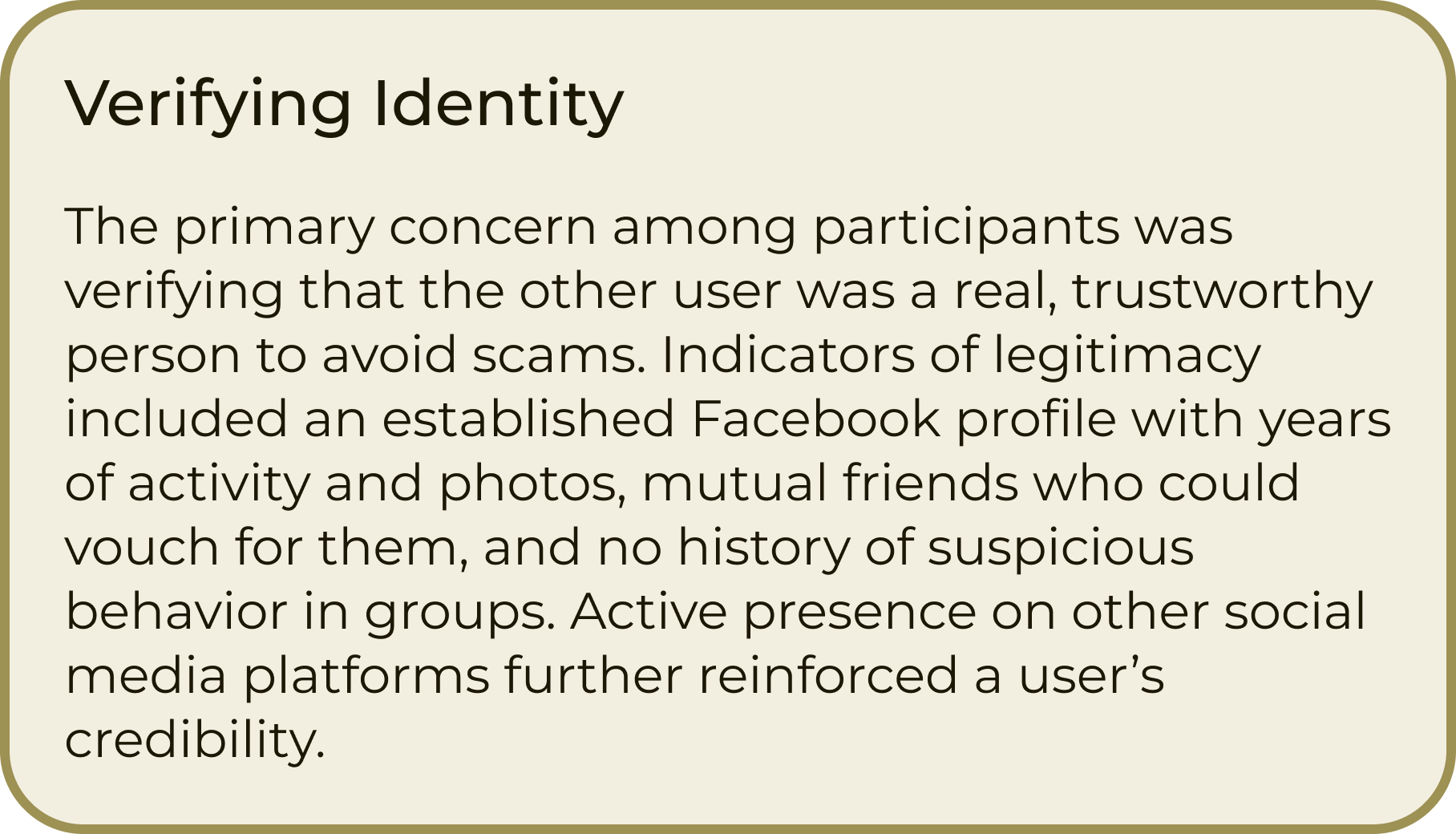
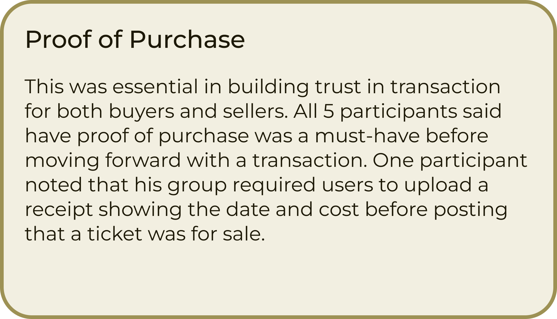
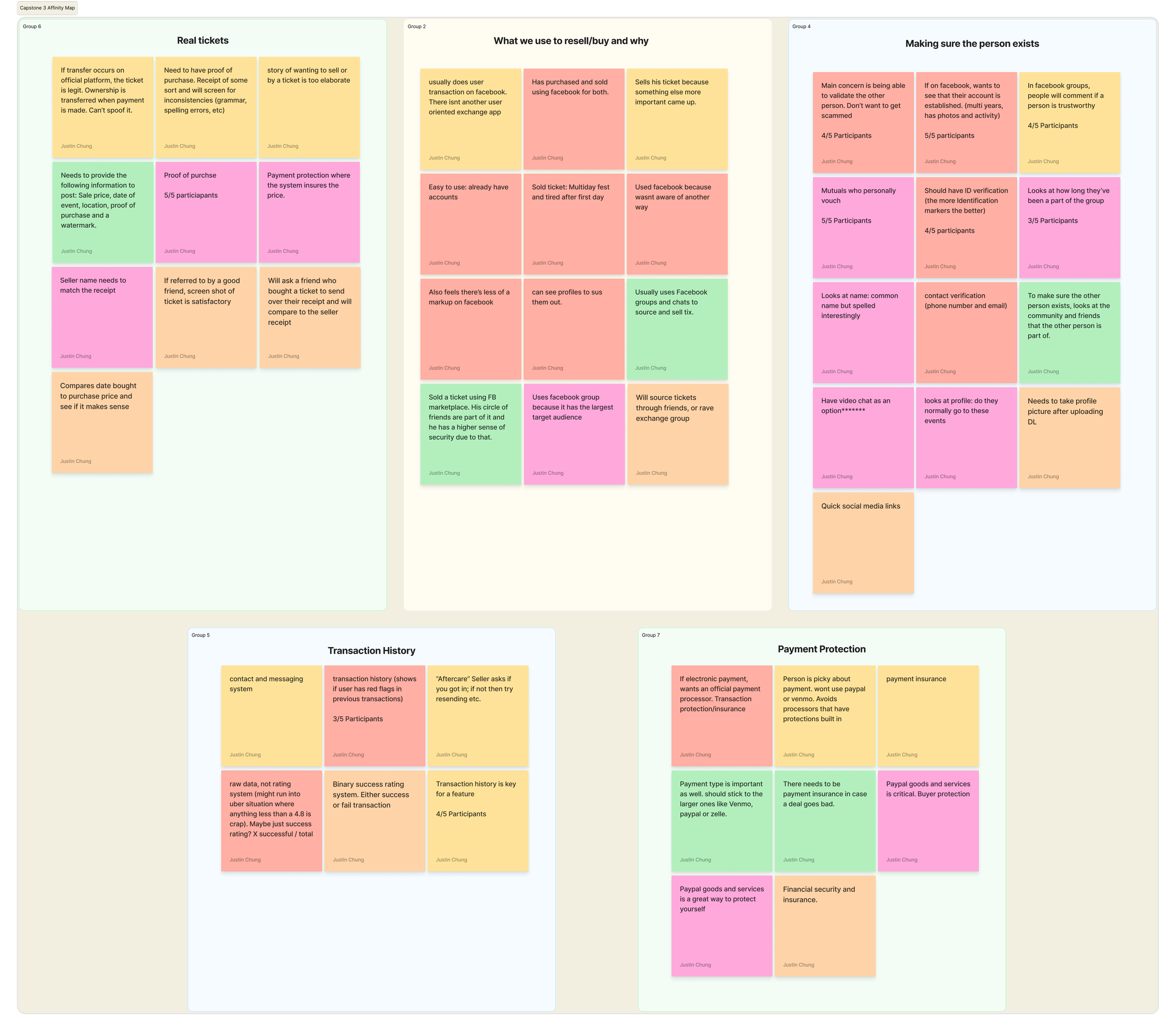
The most consistent concern across all participants was being able to tell whether the other party was a scammer or a legitimate buyer or seller. After compiling the interview data into an Affinity Map, I concluded that the following themes were critical in conducting safe transactions:
Safety and Trust Principles

Ticketmaster and AXS


Affinity Map
After collecting interview data, I organized key insights into themed groups using an affinity map, allowing patterns and shared user needs to emerge clearly.
Competitor Analysis
Following the interviews, I performed market research to find products that fit the needs described by the participants. I eventually found 4 products that each solved a different concern: Facebook, Ticketmaster, AXS, and TIXR.
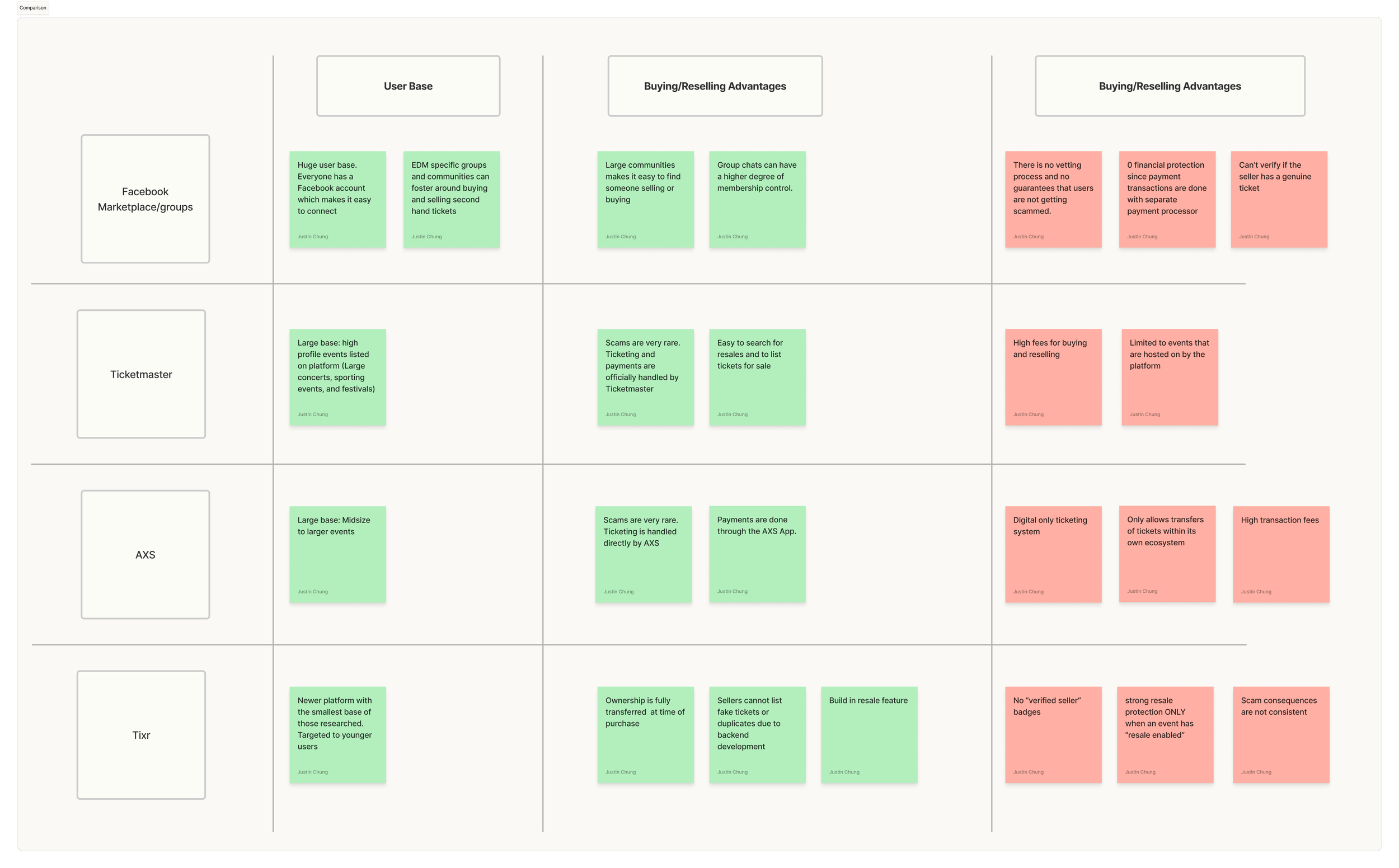
Facebook Rave Groups
Based on my interviews, the main way users validate others is to check their profile. By looking at their posting activity, photos, and negative comments, users are able to determine if they want to interact with them
AXS: Buying and Reselling tickets is simple, but events are limited to events that are officially hosted by the platform
Site Map
This platform provided the most flexibility because users can create posts that they are looking for/selling tickets for any show. However, unless you searched for a specific event, the posts were disorganized with no central hub for each show.

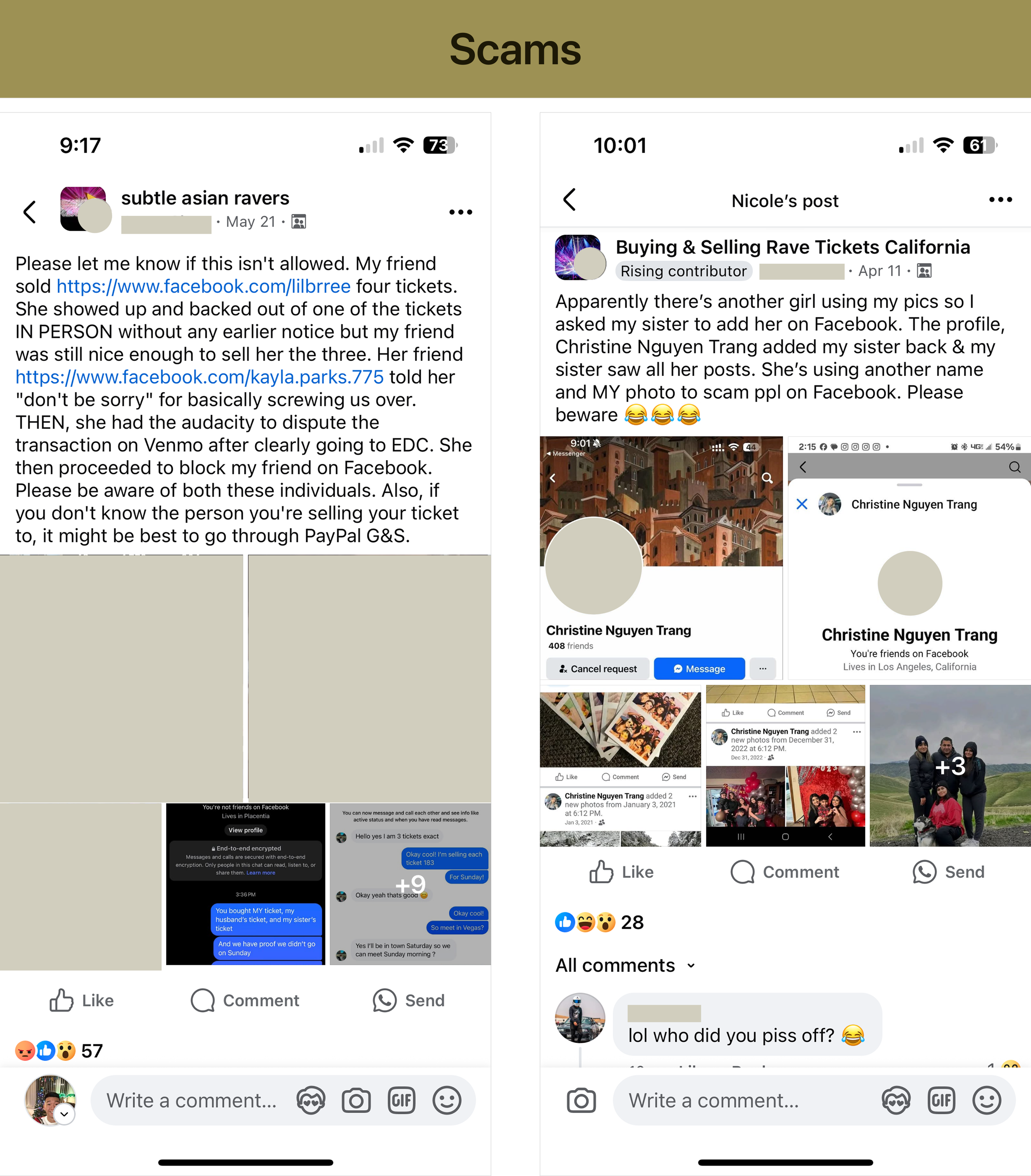
As I was going through the postings, I came across 2 common scams. One was to initiate a payment dispute after tickets were transferred and the other was a fake profile pretending to be another user
Ticketmaster: Similar to AXS where there is an interanal buying/selling of resale tickets. However they have a bad reputation of large service fees
POV
I want to design a dedicated platform for peer-to-peer ticket exchanges that feels as convenient and community-driven as FB groups/group chats, but as secure and reliable as official resale channels.
I want to understand what security/verification procedures I need in a user-to-user exchange app that lets users feel comfortable conducting a transaction almost instantly.
How Might We
How might we design a peer-to-peer ticket exchange platform that combines the trust and security of official resale channels with the ease and community feel of informal groups?
How might we reimagine peer-to-peer ticket exchanges to foster trust, transparency, and community accountability, so users can confidently and securely buy or sell tickets without hesitation or fear of scams?
Project Goals
While performing market research, I found that no other app addressed my participants’ safety concerns while also conducting transaction services. I decided to take the opportunity to create a Business Model Canvas to identify potential risks and figure out areas where my product could differentiate itself in the market.

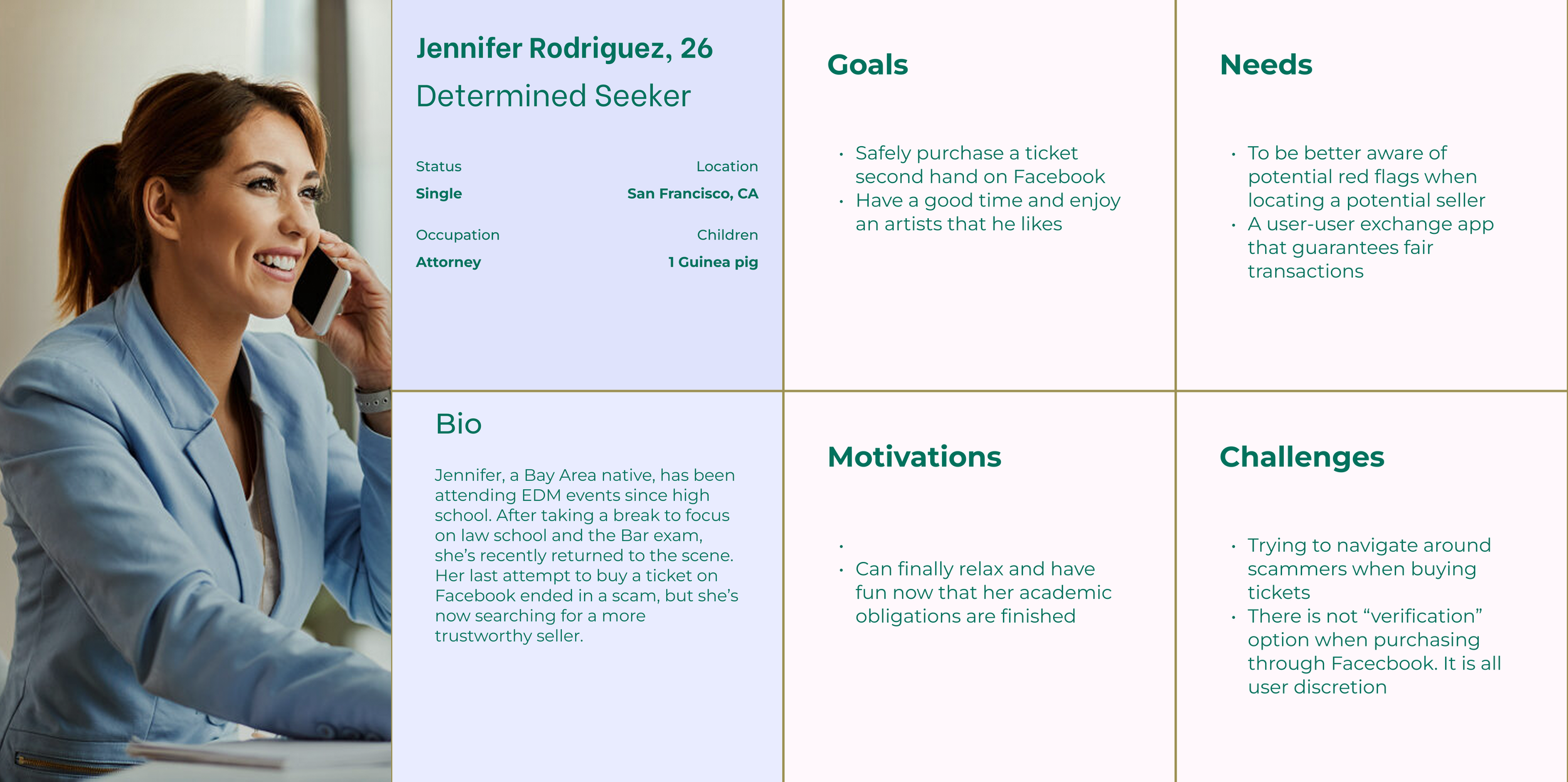
User Persona
For the personas, I combined a few characteristics from the users I interviewed and also applied personalities from a few of my raver friends. I sometimes have difficulties coming up with a believable persona, but I felt this method helped me humanize this procedure.

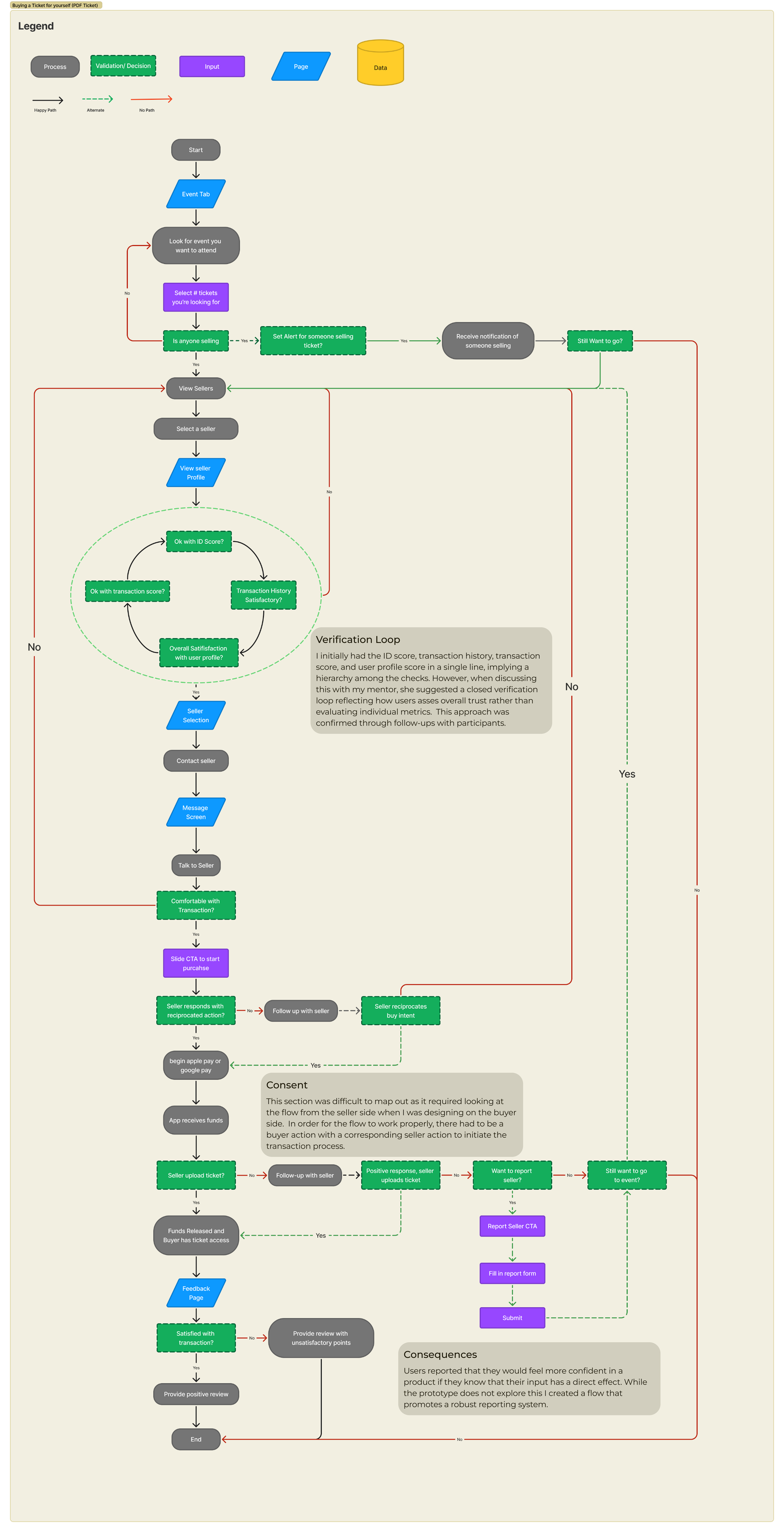
User Flow

Putting the Ideas to Work
The design process begins with hand-drawn wireframes, progresses to a low/mid fidelity digital prototype, and ends with a high-fidelity design with brand colors included. In this section, you will see how I approach solving user needs at every stage.

Digitizing the Sketches
Next, I brought my sketches to Figma with a low/mid fidelity prototype. I worked my way through the app by designing the critical stages in my user flow. In this stage, I created multiple concepts of key screens and showed them to potential users to receive feedback.

Brand Inspiration
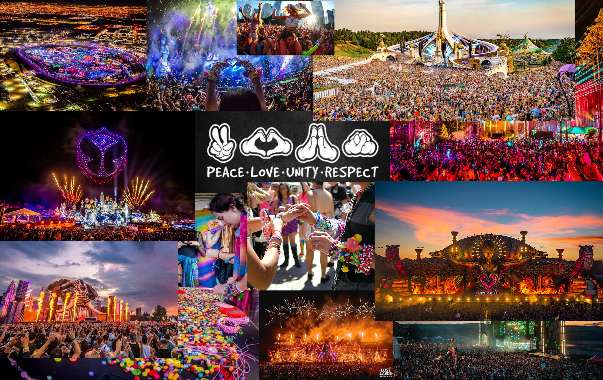
When I think of raves, I’m reminded of 3 day music festivals. Especially EDC Las Vegas, which feels like the mecca of EDM events. Starting at 5pm and ending at 5am, it’s a surreal experience living life in reverse. Entering at sunset and dancing until sunrise with half a million like-minded people is something you need to experience to understand. That’s why my mood board is inspired by the bright, cheerful, and energetic colors, framed by the hues of sunset and sunrise. Although they are opposites, these events complement each other beautifully.
Branding and UI Kit

Final Designs

User Testing
After creating my high fidelity wireframes and applying my design kit, I proceed with the user testing phase. The test was broken out into # of distinct tasks:
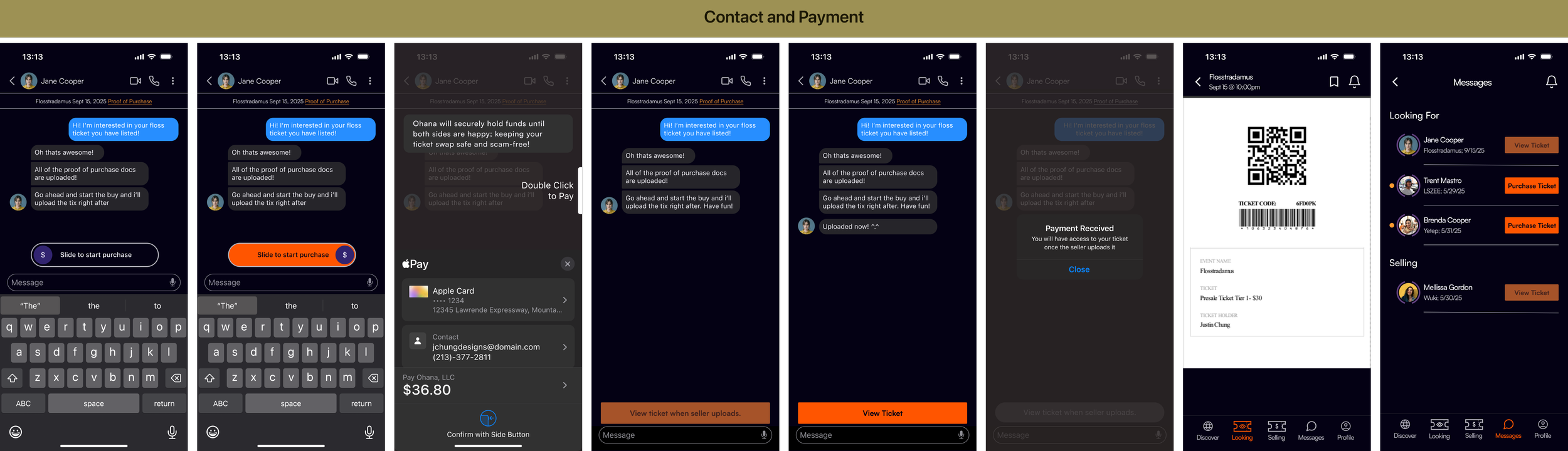
Log in and find someone selling a “Flosstradamus” Nightclub event ticket;
Locate the main profile of the trusted seller;
Get in touch with them and purchase their ticket.

User Testing Summary
Of the 5 testers that participated, 3 are active in the Facebook Rave Exchange groups, while the other two would rely on their friends to source tickets. Having perspectives from users who don’t usually use 3rd party ticket platforms would be beneficial to my design.
The results were mainly positive. Overall, users liked the app’s visual design and found it intuitive to navigate. The best compliment I received was they would’ve felt comfortable if the transaction had been real. Given that some of the screens were information heavy, users appreciated the tutorial modals that clarified key elements. The User Profile page, a critical screen in the flow, was successfully accessed by 4 out of 5 users without any issues.
A major usability gap that surfaced was the event search flow. When told to find a specific event, 3 out of 5 users tapped on the event-type divider CTA instead of manually scrolling like I had planned. Interestingly, the 2 users who relied on friends to find tickets, followed my exact design flow. While a functioning search bar will eventually address this, I still want to refine the flow to encourage organic event exploration. Smaller issues, like text contrast/visibility and additional event sorting features were noted and will be easy to address.
Iterations
Based on the results from the testing, the following iterations were made:

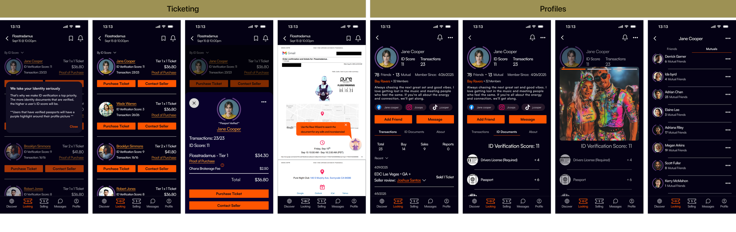
The profile quick view, accessible from the ticket listing screen, was a key screen in the design. Critical design updates included in the first iteration include verification features like a direct “proof of purchase” button and a purple ring around the profile photo to indicate passport verification by the other party. This version was used for the first round of user testing. Based on feedback, visual updates were made for clarity- text added below the profile photo and a tutorial modal was introduced to explain the verification ring. The “red flag” warning was enlarged for visibility, but only appears when a user has a report, to avoid unnecessary negative signaling.

60% of the users stated that having an explanation of the ID score would help them decide which sellers they would rank higher as trustworthy.

Final Prototype
40% of users had trouble finding the event through my designed scrolling method. To address that, I included a working category divider to streamline the search. In addition, there is a filter option where you can sort chronologically.

Reflection
I really enjoyed working on this project, especially because it’s rooted in a community I’m personally connected to. Many of my friends attend EDM events, and I'm part of the same circles, so it was fascinating to observe the different ways people verify others before making a transaction. When designing the user flow for this project, it felt like I was creating something to personally help my friends.
The goal of OHANA was to create a peer-to-peer ticket exchange where all the verification tools—identity checks, transaction history, and proof of purchase—exist in one place. I wanted users to feel confident enough to hit the "purchase" button without hesitation. Based on the feedback I received during testing, I believe that goal was successfully met.
Looking back, I would have included more users who are not too involved with third-party ticket purchasing. In the interview phase, this would have provided good data as to what unfamiliar users would look for in these transactions and could provide a deeper understanding of the information architecture. The same reasoning applies to the user testing phase. If I am aiming for market expansion, new users are inevitable, and being able to design around their results would be invaluable.
Moving forward, I’d love to evolve OHANA into something more social—an app that not only facilitates safe exchanges but also helps users connect at events themselves.