

Mobile App Design
OHANA
At a Glance
| Case Study
Solo Project

Ohana is a mobile app design created to help EDM (Electronic Dance Music) event goers have a platform to sell and buy tickets in a safe maner. I have friends who frequently attend these events and my motivation was to create a product that would help them out. I wanted to give my friends the luxury to buy and sell tickets conidently without a second thought.
The Problem
| My Role
UX/UI Designer, research, branding, wireframing,
prototyping, user testing
Payment Processors
Participants indicated that the other party using a well known payment processor was critical in going through with the transaction
| Timeline
4-6 Weeks
| Tools
Figma and Figjam
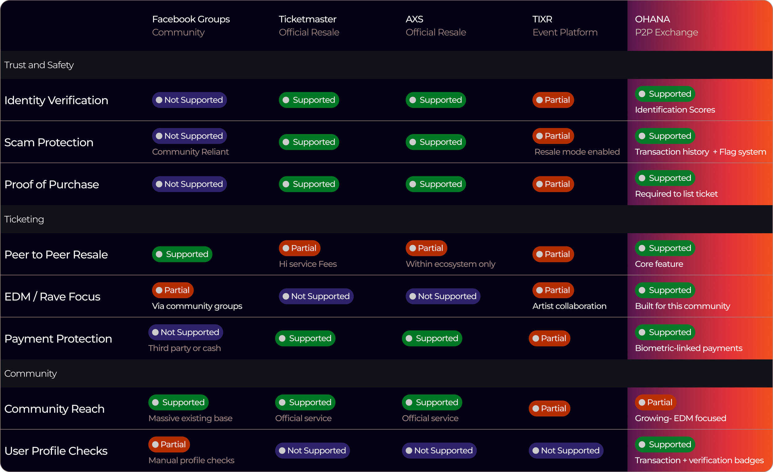
Informal Channels Dominate Ticket Resale, Despite Trust Concerns
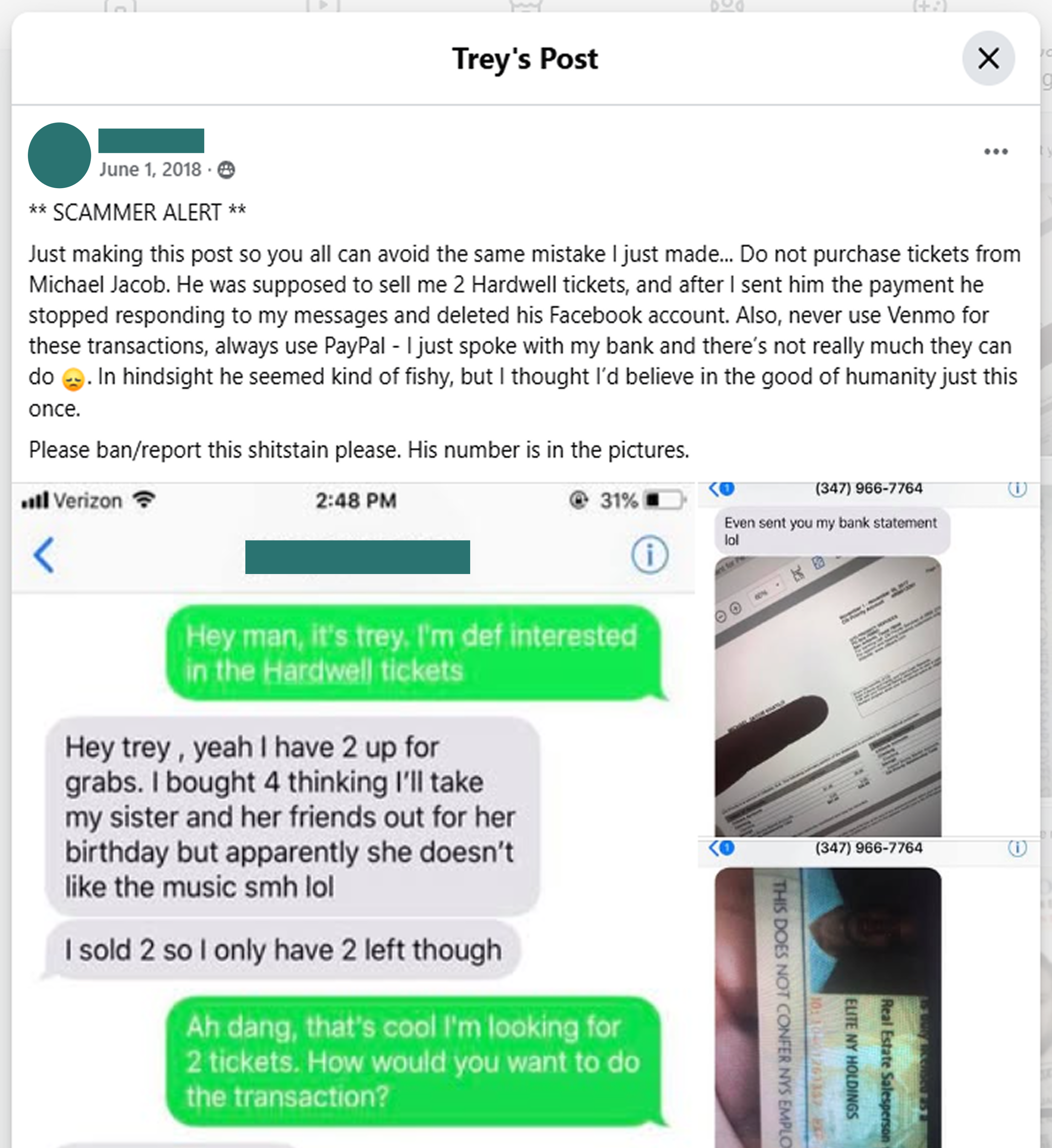
Currently, there is no platform built specifically for safe ticket exchanges between users. When my friends look for tickets, they usually turn to group chats or Facebook groups. These methods work due to the size of the communities, but eventually, you’ll see posts asking for a “legit check” — or worse, warnings like “Don’t trust this person, I got scammed.” While ticketing platforms like Ticketmaster and AXS offer official resale features, they often come with added markups and fees due to their business model.
How does the market stack up?
The Solution
Give the People What They Want
OHANA. A mobile app that enables peer-to-peer EDM (Electronic Dance Music) event ticket transfers. The product is user-driven, promoting safe transactions through identity verification and transparent transaction history.
Safe Doesnt Need to be Slow
OHANA provides multiple ticket listings with critical information at your fingertips. We do the verification so the users can get to the fun.
Interview Insights

Even out the Playing Field
OHANA provides multiple ticket listings with critical information at your fingertips. We do the verification so the users can get to the fun.
3 Themes Were Consistently Brought Up By Our Participants

Identity Verification
Participants found that being able to verify whether the other user was genuine and trustworthy was a primary concern
Without it, every transaction is a leap of faith
To address these concerns, OHANA will need a robust profile system that will provide transaction history and multiple levels of identity verifications

Trust, but Verify
OHANA provides multiple ticket listings with critical information at your fingertips. We do the verification so the users can get to the fun.
Reputable processors make or break a deal
OHANA will need a payment system that will provide financial security to it’s user base. Biometric payments already linked to a user’s mobile device would be ideal

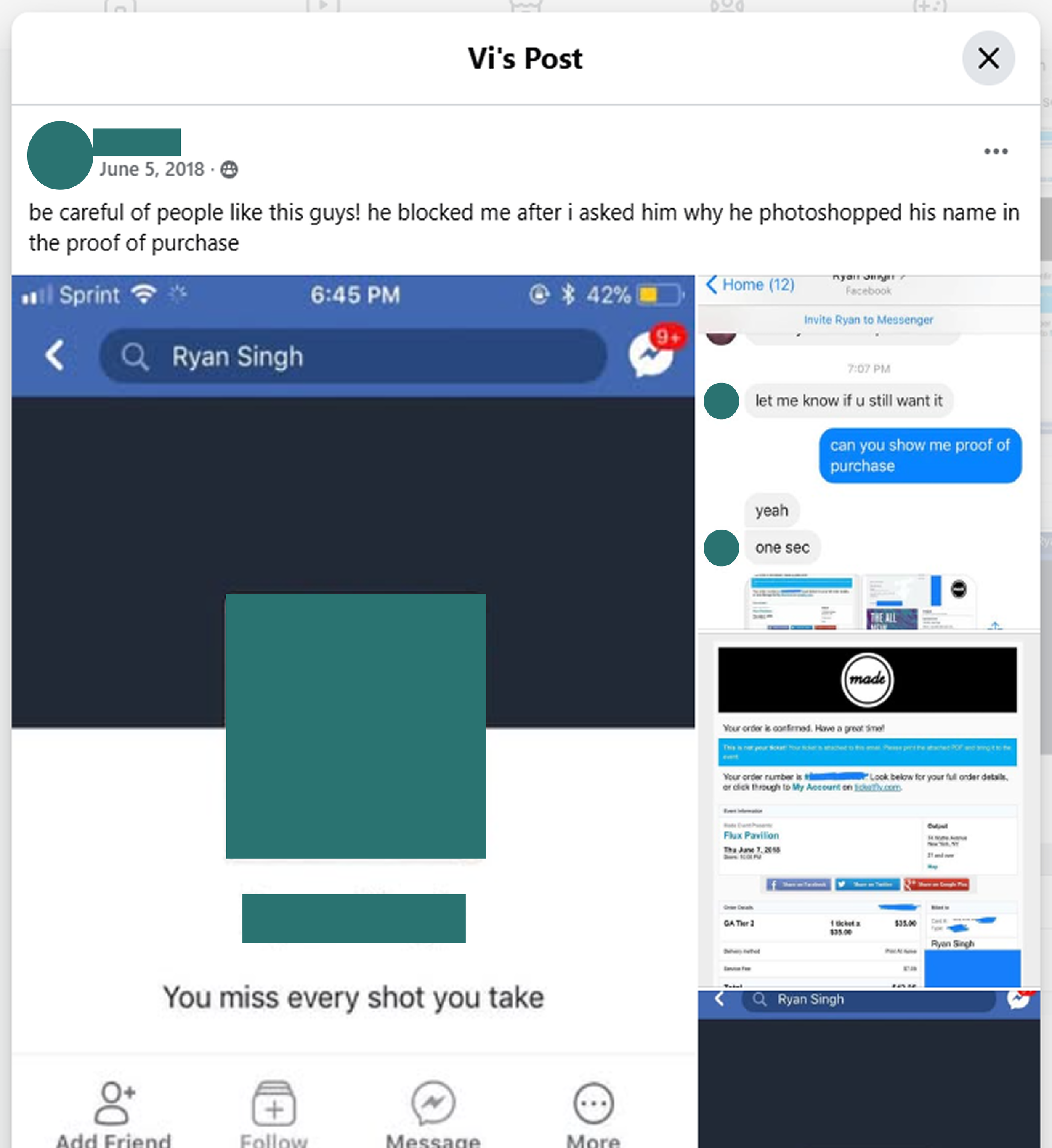
Proof of Purchase
While the participants i interviewed knew to ask for proof of purchase, there was no set rule that it had to be provided
No standards means no accountability
To post a ticket for sale on OHANA, proof of purchase is a required document. No exceptions.
How might we reimagine peer-to-peer ticket exchanges to build trust and accountability, enabling secure, scam-free transactions?


User Flows
1: Ticket Search
2: Verification Loop
3: Ticket Purchase
So, is there an afterparty?
What I learned
1: Expand the interview pool
Looking back, i would have included more users who were unfamiliar with 3rd party ticket purchasing. Their input could have improved my information architechture and be helpful for market expanstion to new users who are new to the scene.
2: Feel free to experiment
A habit I am learning to break is sticking to a concept when I am content with it, instead of exploring more possibilities. Throughout this project, I had to remind myself that coming up with bad designs is part of the process and putting ideas out there is what’s important.
Next Steps
1: Explore the social media side
The main inspiration for my project is the community that ravers foster. While the events are flashy, it’s the interpersonal connections that keep ravers going back for more. The obvious next step for this project is to expand OHANA on the social media side in order to help connect and foster a community